Lillo Eiendom
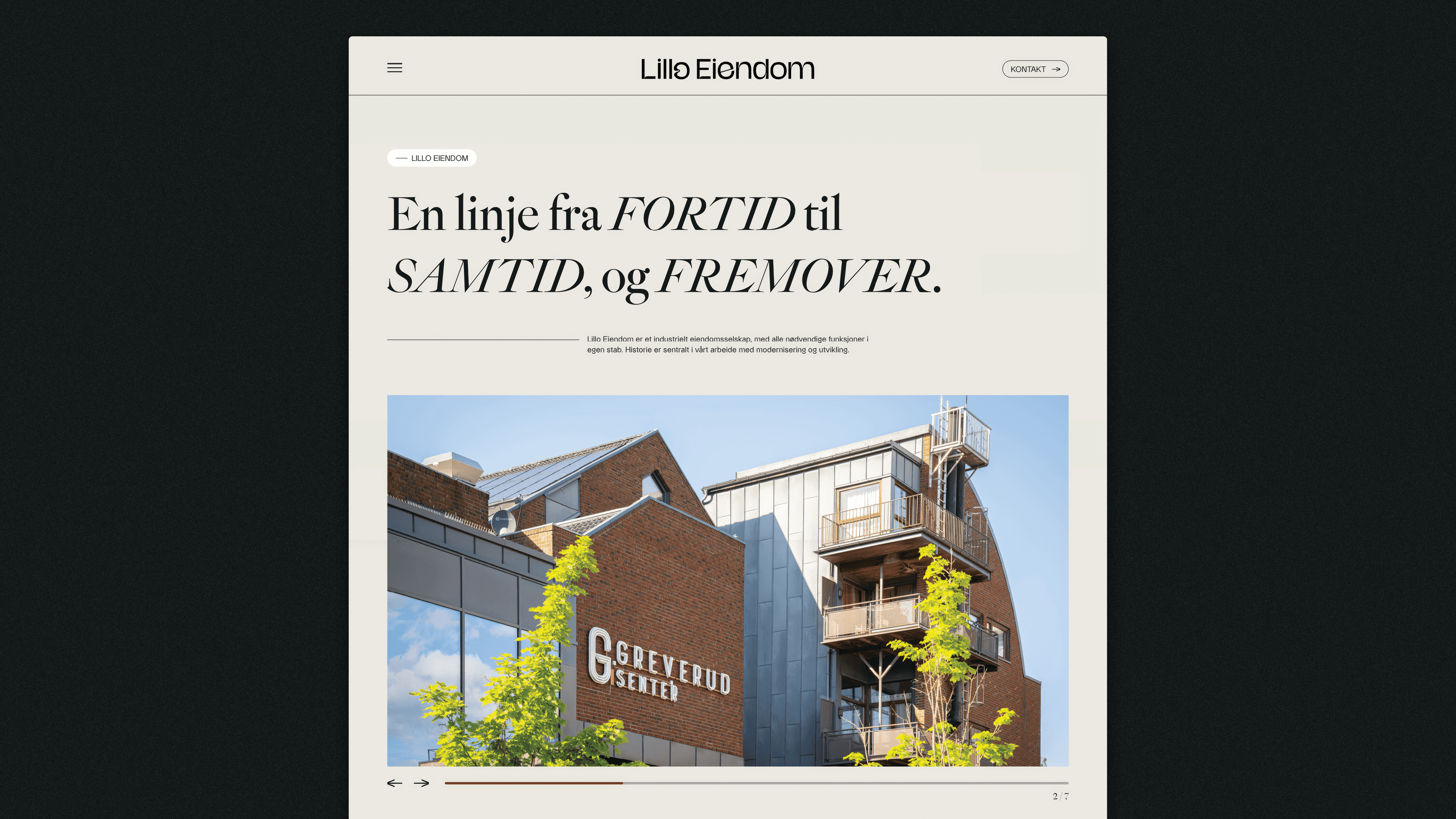
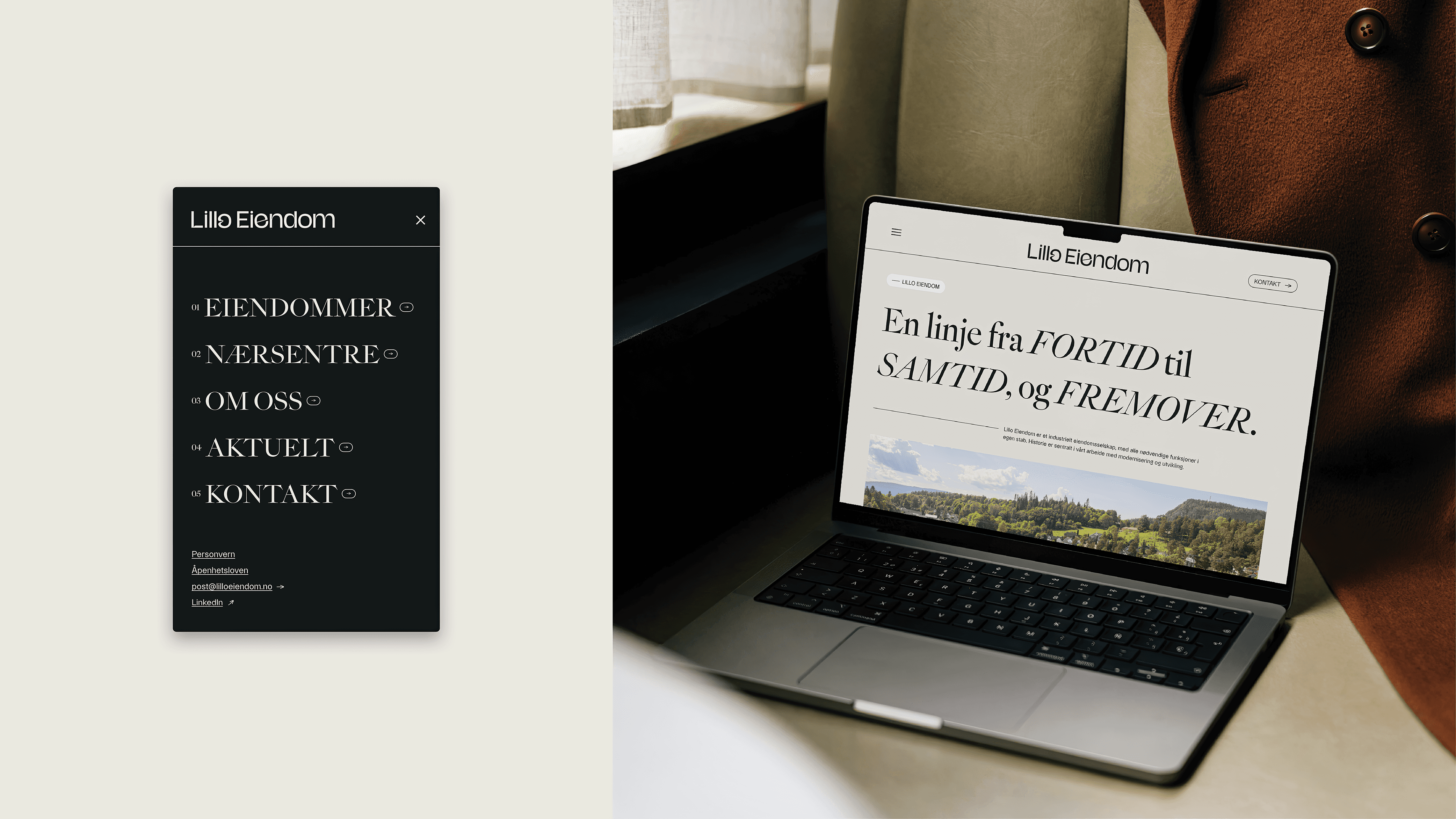
Lillo, or simply Oo, dates back to the Iron Age, where O means “river” in Old Norse. Lillo Gård tells the story of a forest that became farmland, and later a city.
Lillo was the original “ancestral farm,” and during the Viking Age, the population grew and several tenant farms were part of the Lillo Estate. The logo has a vibrant and dynamic design language that represents history and continuity. The O in Lillo is inspired by meanders – the natural curves formed by rivers. A line from the past to present, and into the future.
Team:
• Daniel Ingebrigtsen (AD / Design)
• Igor Nilsen (Animation)
• Dmitry Tkachenko (Photography)
• Heading North (Web Devolopent)